变形金刚G1美版KO分辨教程:大家有什么问题或者发现都可以在AC论坛中的模玩辨别真伪区讨论发帖。咱们闲言少叙,还是直接上主题吧。original=原版 repro=KO
包装上基本文字的比较.
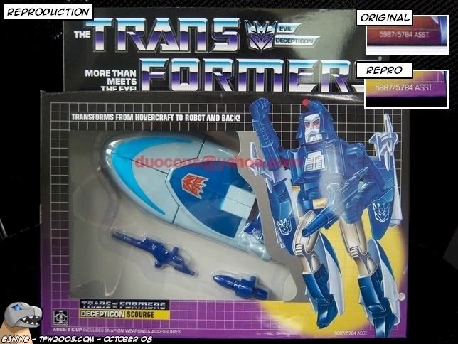
As a nice treat, the KO will be compared against an original from the same case assortment. The KO is claiming to be exactly what I have to compare against.
1.狂派的标志有明显的颜色区别
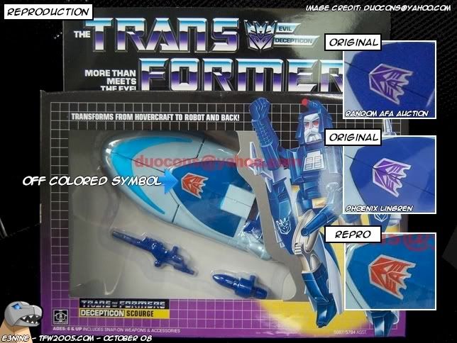
This one sticks out quite a bit. On the original, this sticker is very shiny, glossy, metallic, and reflective. It looks like when they tried to replicate this, the color scheme fell off. What's left is something that resembles ketchup.
2. 包装上的印刷问题
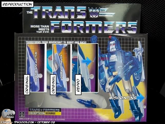
It looks like the side graphics made their way over to the front of the box. As you can see, there's something extra on the side of the KO.
3. ko的这里没有涂色
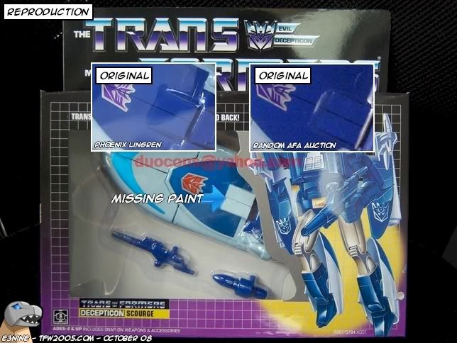
The figure itself is missing some blue. I think there's a bigger issue here ...
3A. 好吧,KO的这款这里直接用的贴纸。。。坑爹啊
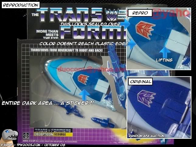
After noticing the missing "paint" in 3, I'm almost sure that isn't paint at all to begin with. If you notice, the entire area is sealed over. Also, the dark blue doesn't quite fill the entire region. I'm speculating that the entire section on the KO is a new sticker.
4. 包装上的颜色过渡缺少一层橘黄色
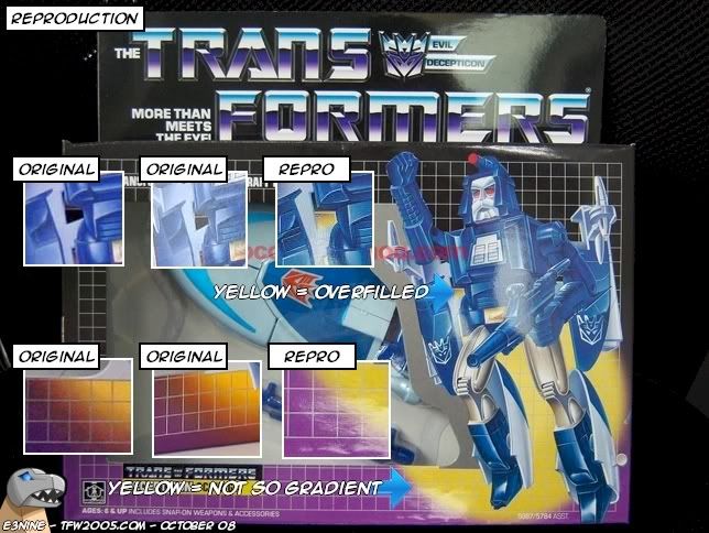
Much like Cyclonus, Scourge sports a harsh yellow gradient. It doesn't quite fade away like the original and it's also over filled. The yellow spot nearly touches his armpit.
5. KO玩具的塑料包装中武器和本体有很大距离
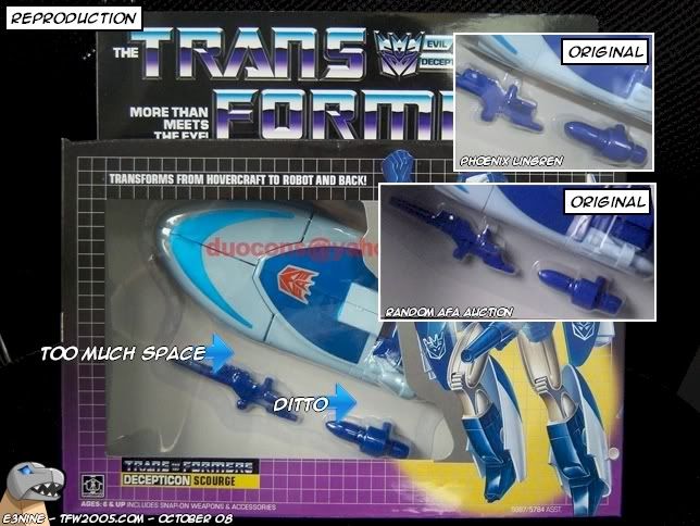
There's quite a bit of bubble gap between the weapons and the figure. It wasn't this wide in the original.
6.KO版的玩具看不见武器插口
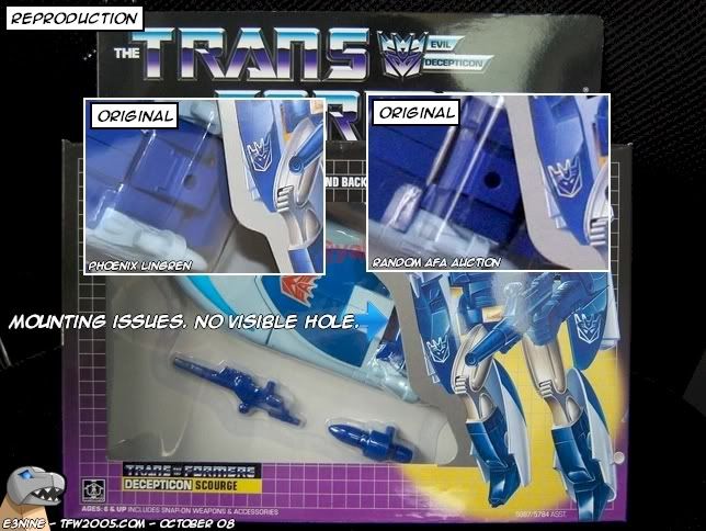
This one can be hit or miss, but pay attention to the blow hole on Scourge. In the originals, it was visible in the window. This can be an easy adjust for the KO makers, but just a heads up on the proper positioning.
KO与正版不同的总结: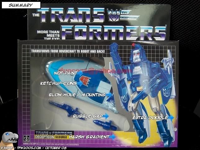

 出货通知 | 布若飞
 《一品芝麻狐》系列盲
 《人类博物馆》非酋欧
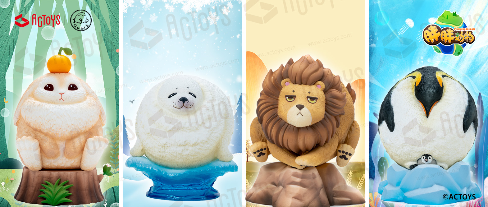 ACTOYS原创设计作品—
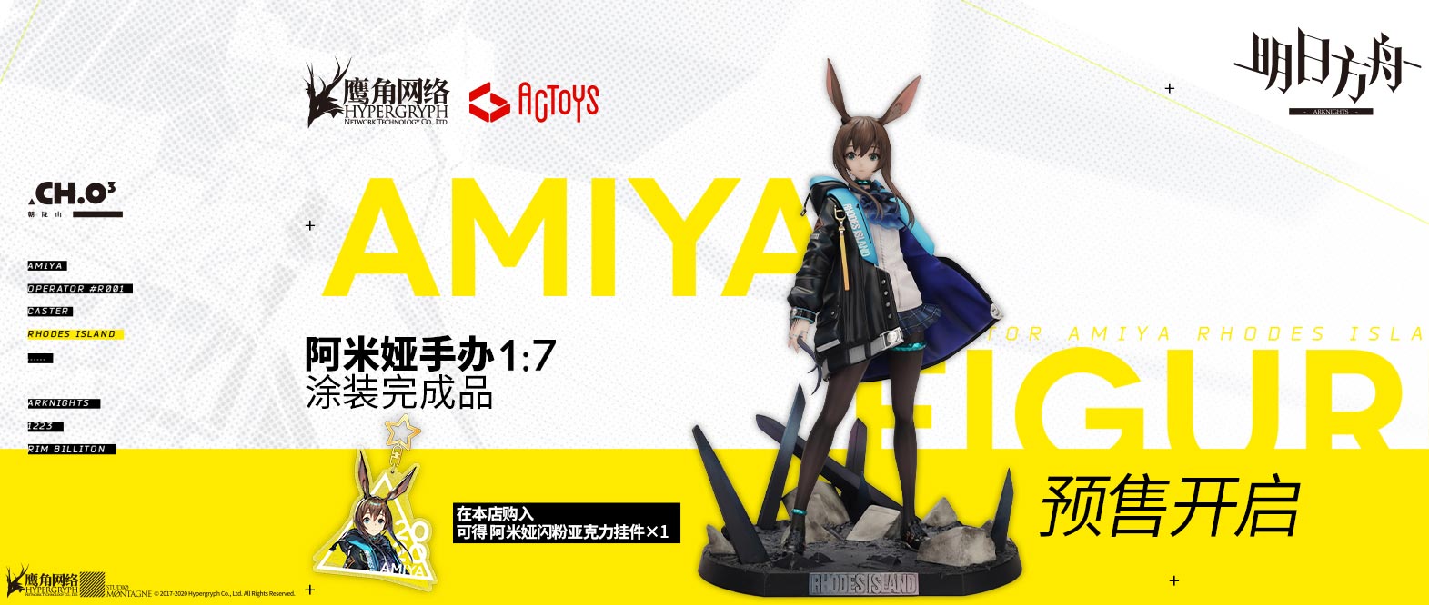 明日方舟 1/7正比例